Tuesday, January 31, 2012

Fine Art Pricing, and What a Messed up World That is

I’m trying to figure out this fine art pricing thing, and it’s driving me UP THE WALL. Near as I can tell, there are two possibly contradictory worlds where fine art gets bought and sold. I care about art being bought because it presents the potential for me to get paid for doing art, and maybe make a living at it. I’m trying to figure this thing out, and here’s what the state of the Art worlds looks like to me:

In world A, Art is hung on walls in galleries and sold to collectors for large sums of money by dealers. If an artist is deemed sufficiently noteworthy, their work ends up in museums, further increasing its value and price. Since I’d love to see some of my art sold for large sums of money, I’m not against this in principle.*

In world B, thanks to digital media, it’s possible to make digital copies of an image that are practically indistinguishable from the original. These are then sold for rather less money to rather more people. Since I would really like my art to be owned and enjoyed by people, I find this prospect exciting.**

There are incompatibilities between the two. In their view of art: in world A, you're potentially handing control of your art over to other people. In world A, you're in the position of having to figure out how to sell your art on top of making it.

I don’t have much else to say on this topic right now, other than that it’s giving me massive headaches in figuring out what to do with my art next.

*World A sounds snotty, but it deserves a lot of credit. If not for the efforts of art dealers and collectors, Jasper Johns might have spent his life illustrating advertising copy, and a guy like me might never have the chance to look at a real Picasso. I would like to be represented by a good gallery, and have the freedom to execute some of the kickass ideas I have in my head. On the other hand, this world creates a distasteful façade of exclusivity and obfuscation around how art is really made and what it’s really about.

**World B sounds pretty awesome! Especially if you’re already and indie publisher like me. But then again, the pressures of trying to be publisher or a retailer are a direct drain on the time and energy that could be invested in art; and you can be a great artist but be really crappy at merchandising. I do want to make cool stuff out of my art, but I’m really bad at (for example) running an Etsy shop.

Saturday, January 28, 2012

This is Almost Over!

This month I hung 95 pieces of my artwork at Cupcake Royale Capitol Hill:


95 pieces is a lot, by the way. Between drawing, framing, hanging, and (this Tuesday morning) taking them down, that's a significant time investment. I'm also kind of proud of these big panels. I did a lot of things wrong, but these are only the first run of this idea, so I'm pretty happy about them.

This was also the maiden voyage for some much bigger dungeons:


This is all coming down in a few days, so if you're in the neighborhood, this is your last chance to visit

Thursday, January 26, 2012

Megabot 101's Space Dungeon


There's this online strategy game called Ultracorps that I used to play a lot. The original version came out in the 90's and was pretty revolutionary at the time. The game was based on an online comic called "Megabot" by Stan James and Brandon Gillam. The thing is, almost everybody was on dialup in those days, and even if you had DSL, the download times for the comic were murder, so hardly anyone read it. I did, though. Megabot 206 was the hero of the comic. Or maybe it was Megabot 6. This dungeon is my homage to that story.

You can buy prints and customizations of Megabot 101's Space Dungeon on Etsy.

Tuesday, January 24, 2012

Wizard's Tower


Wizards prefer to live in towers as a rule. Nobody is quite sure why this is, least of all the wizards. A necromancer often lives in a black tower, which might be made of corrugated iron. An ice wizard can make her tower of ice. A fire wizard's tower is visible for miles. An air wizard's tower might not be visible at all.

And of course there are all sorts of wizard's who don't bother with such displays,though they are nevertheless very powerful. This wizard is a library wizard, though he also does arcane surgeries, mostly to make ends meet in this rotten economy. You might find almost anything in a Wizard's basement.

You can buy prints of the Wizard's Tower on Etsy.

Friday, January 20, 2012

There is a mathematical law that determines the rate at which the Internet spawns new social networking tools. There is a new social bookmarking site called Pinterest. You should not care about this, except for the dungeons.


Basically Pinterest is a temple to the deities who governs art and design and that thrift store bike you repurposed as a wash basin stand for your off bath.

Clearly it needs more dungeons.

The Art of Dungeoncraft board on Pinterest represents the love of dungeons and art in the world of pinterest. Would love for you to check it out. Also, if you happen to be obsessed by dungeons (and/or art, possibly), you could become a contributor too.

Monday, January 16, 2012

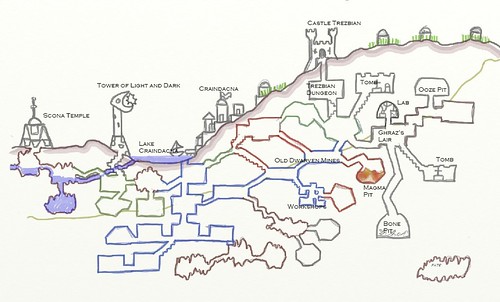
Trezbian Dungeon

Trezbian Dungeon by Marasmusine
Trezbian Dungeon, a photo by Marasmusine on Flickr.

A little blast from the past, some really great How to Host a Dungeon art by Marasmusine on Flickr.

Monday, January 9, 2012

Frankly

It's funny. Looking at my art alongside the many excellent artists exhibiting in the Capitol Hill Art Walk, I realize my stuff looks kind of crappy by comparison (like this is pretty cool, and this show is chock full of awesome). But you know what? I don't give a damn! Yay, me!

Saturday, January 7, 2012

Tossing out the Grid

Listening to The Walking Eye Podcast actual play recordings of Dungeon World lately. I love AP recordings of old-style D&D games. Dave's game gives me a very vivid impression of the landscape of the Grundloch dungeon that comes in the Dungeon World Red Book which is nevertheless really different from how I imagine the same space. I think part of this is a benefit of tossing out the grid and using more freeform dungeon maps (disclaimer: I drew the map for the adventure, hence I'm inclined to interpret it as pure awesome). Without the grid, you're free to imagine the dungeon space more thoroughly. Does anybody have similar experiences that back up or contradict that observation?

So toss out the grid already?

Friday, January 6, 2012

Art Party Date Change!

So due to a change or miscalculation of the date of the Cap Hill Art Walk (not sure which), we're going to have the art opening on Thurs Jan 12th (instead of the 19th). I'm really sorry if anyone actually made plans for the 19th.

Thursday, January 5, 2012

Crash of the orthodox astronaut on the planet of the golems.

Flickr find - serious weirdness.

Wednesday, January 4, 2012

How much detail is too much?

Stefan Poag has a post at his blog about Kickstarting the Mines of Kunmar megadungeon project. Then, in the comments he asks a very, very important question.

A little background: Stefan made some level maps and rough notes for the dungeon years ago, which ended up posted somewhere as a PDF. Somewhere in my endless trackless wandering seeking new dungeon maps on the Internet I found them, printed them out, and used them as the basis for a little side game of Apocalypse D&D. Stefan found my AP reports. So based on the fact that his rough notes have provided a couple years of play, Stefan asks:
if I gave him the full text, would I be doing him any favors?
That's a huge question for an adventure designer to ask right there! The obvious answer I'd give Stefan is: provide detail as deep as you feel artistically inspired to do. I'm convinced it will be awesome all the way down, because what you've already created is awesome! If it doesn't fit your inspiration and needs to provide more detail, don't provide it.

But there's a bigger question about how much detail your game materials can and should provide. There is some value to materials that don't give you everything you need to play. The value is space to flesh out with your own ideas, stuff that fits your campaign, or whatever you grabbed out of the latest issue of Fight On!

MoK as it currently stands is a huge Rorschach test of the dungeon. For a given sub level (and there are bout 30 of these), I might have four sentences describing the general situation, a description of one deadly trap or encounter, and a few scrawled margin notes. it's a huge challenge to fill in those spaces with good material, but it's ultimately rewarding. It's also not particularly easy!

There's a line someplace where the source material stops being a framework to build on and starts being a prescriptive guide. Running MoK is almost pure improv. I wouldn't try to run Tomb of Horrors that way, or Stonehell. I don't know exactly where the line lies. Maybe it's somewhere just this side of Vornheim. What I do know is that there's room for more improvisational adventure material!

Tuesday, January 3, 2012

104 Dungeons

What did you do for New Year's? I spent New Year's Day hanging 104 dungeons on a wall (give or take).
So the show is hanging for the Month of January at Cupcake Royale on Pike Street here in Seattle. We'll have a party to celebrate on the evening of the 19th to coincide with the Cap Hill Art Walk. Here's the Facebook page for the event.